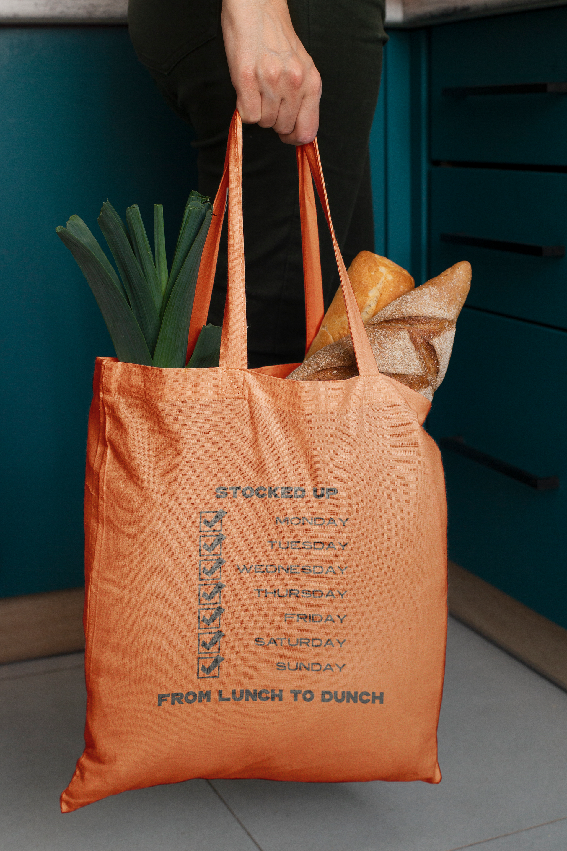
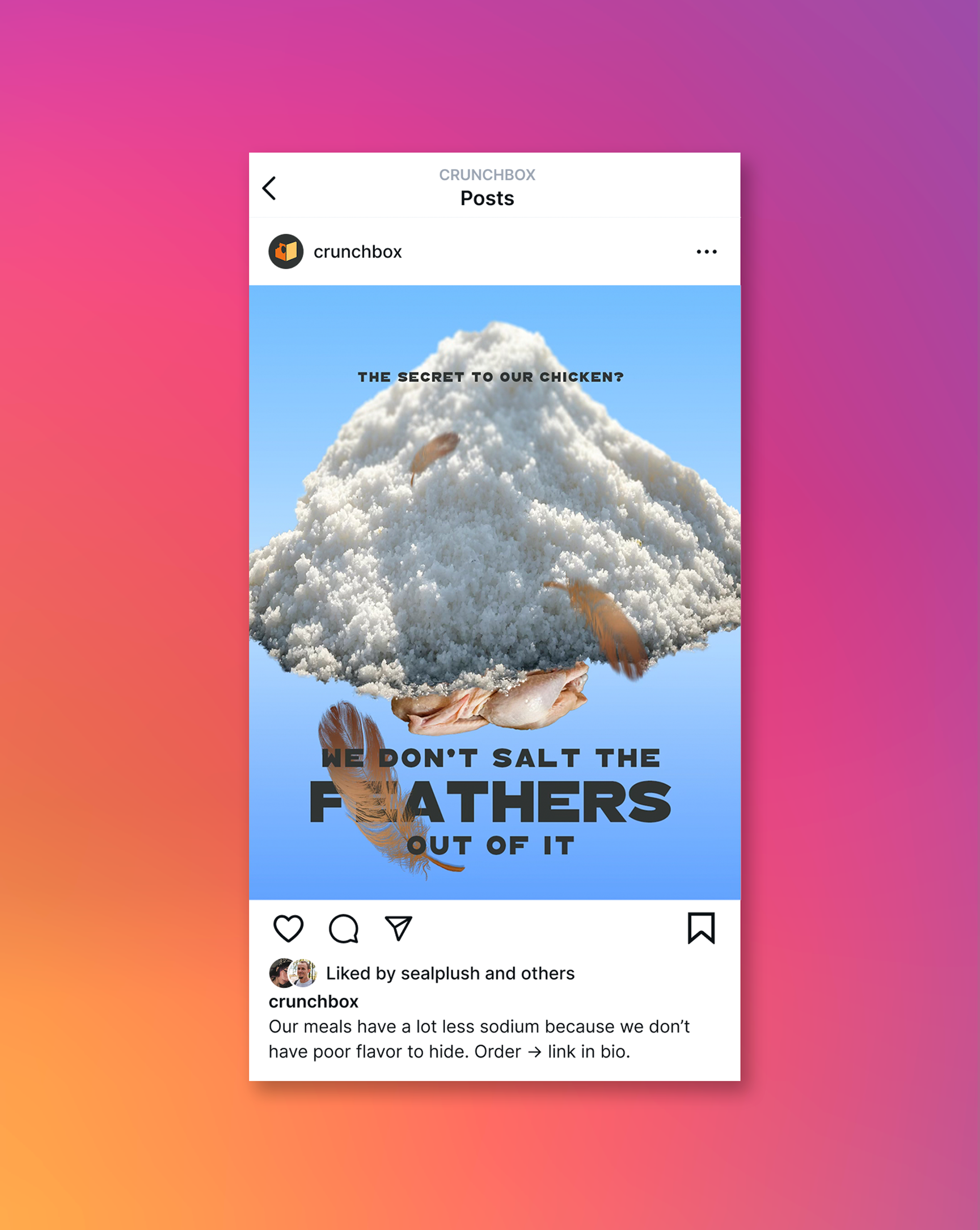
Crunchbox is a ready-made meal company that markets itself on delivering delicious meals at an affordable price, targeted towards college students and working adults that find themselves too tired to cook at the end of the day. Orders are taken through our website and app, where you can pick how many meals you’d like to get per week and what kind on a rotating menu. Emphasis is placed on the meals being freshly made instead of frozen out the assembly line.
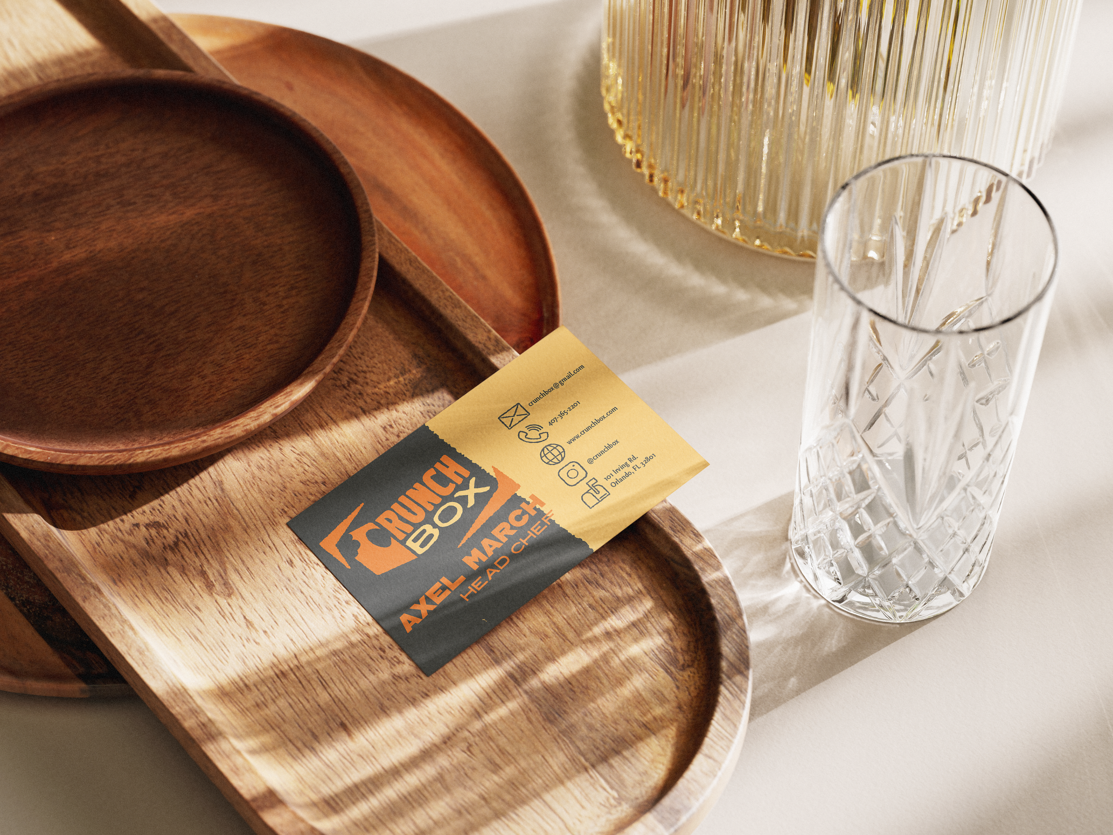
It is also first and foremost a project done out of love for my dad and how he puts his own for his family into everything he cooks. This company wouldn’t exist without him. Figuratively... and literally! He’s got years of experience in the restaurant industry under his belt, serving as the head chef.
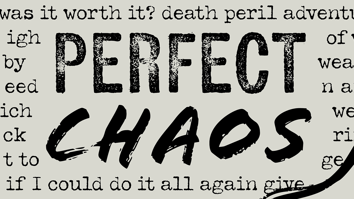
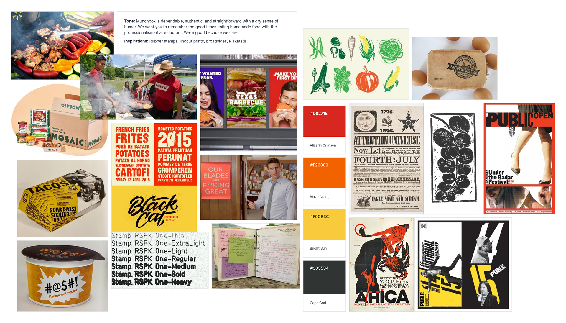
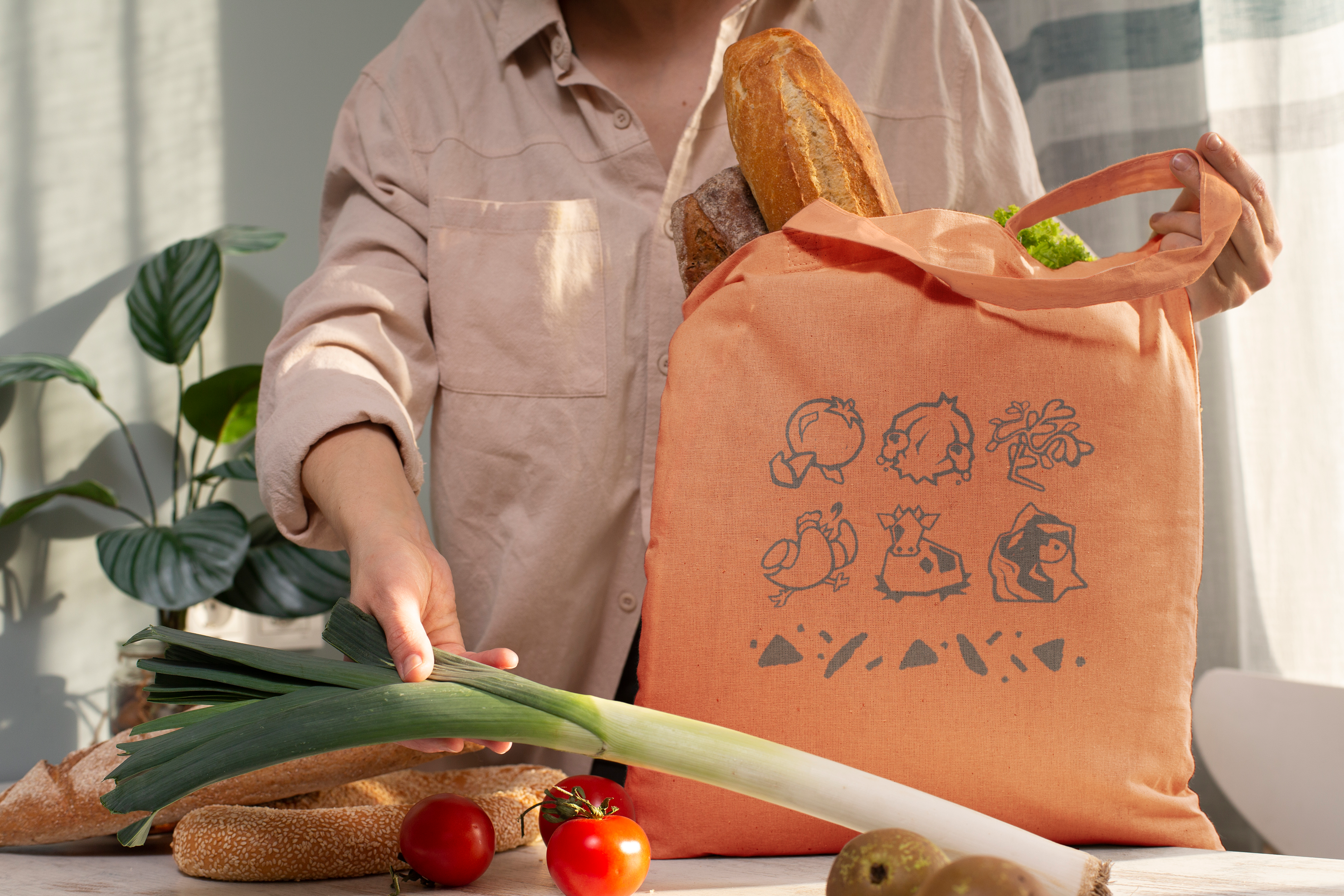
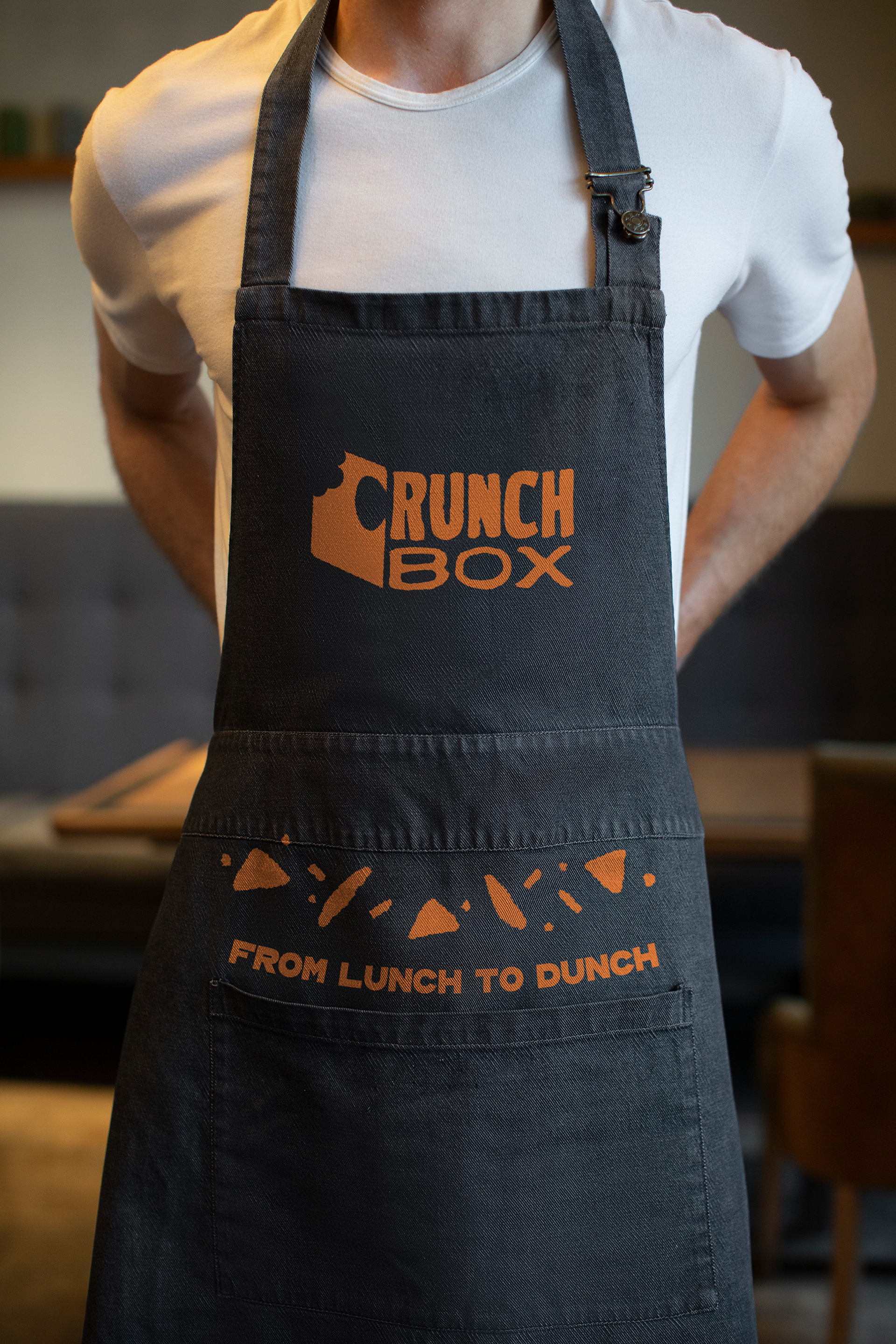
The visual identity takes heavy inspiration from rubber stamps and wood type. These applications of texture throughout serve to make the brand feel more authentic, as handmade as the food they hold inside. The little imperfections from the process are what make it human.
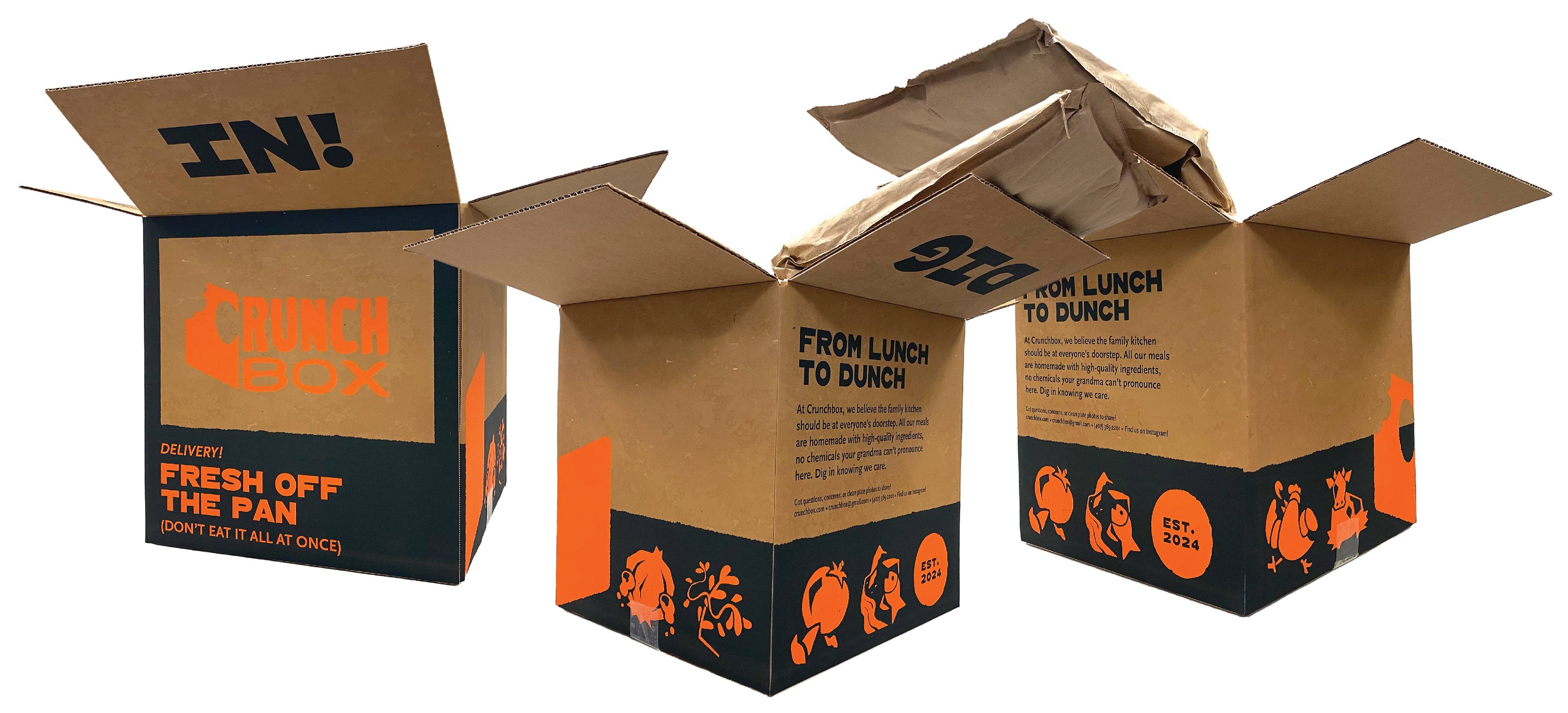
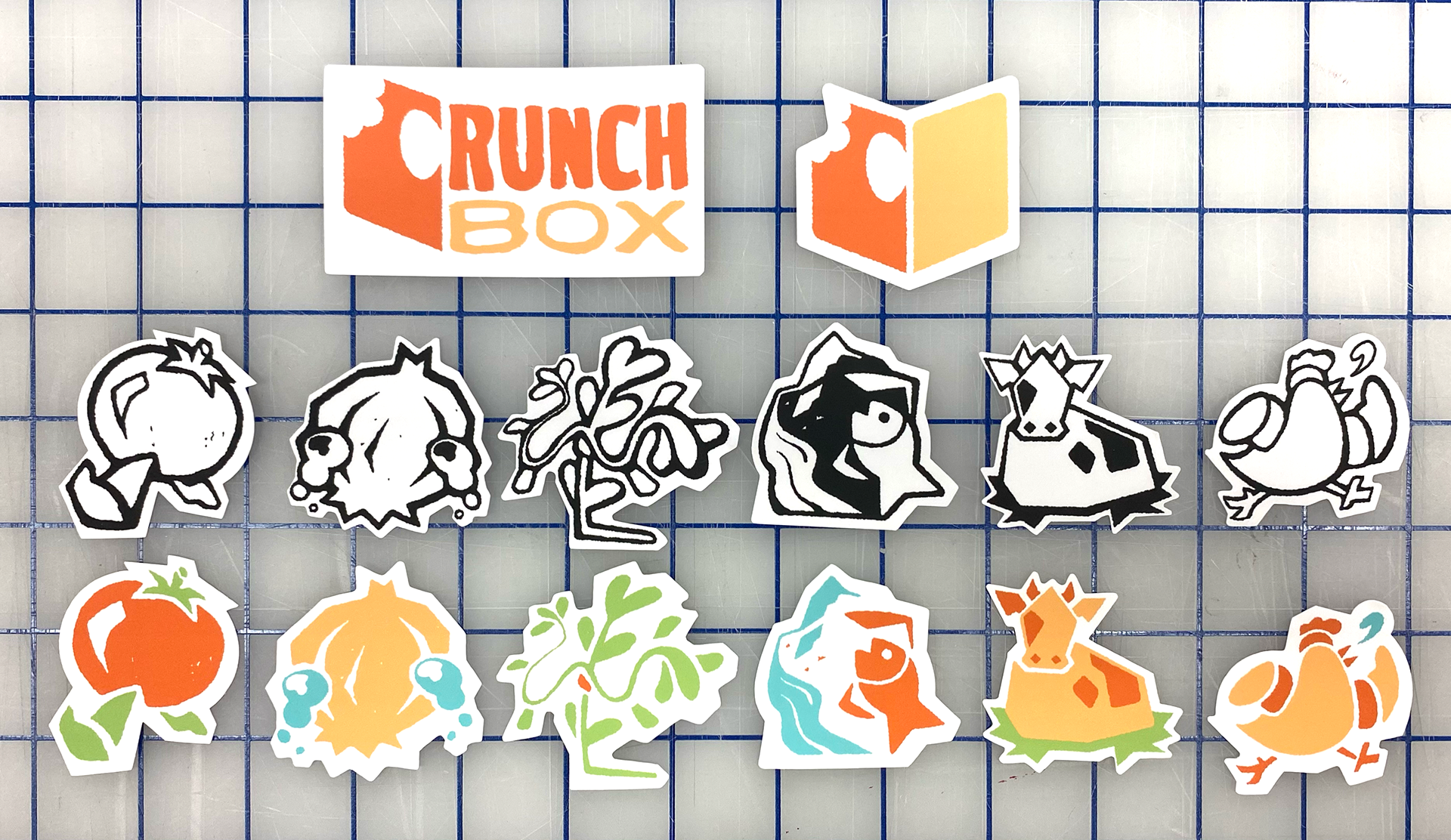
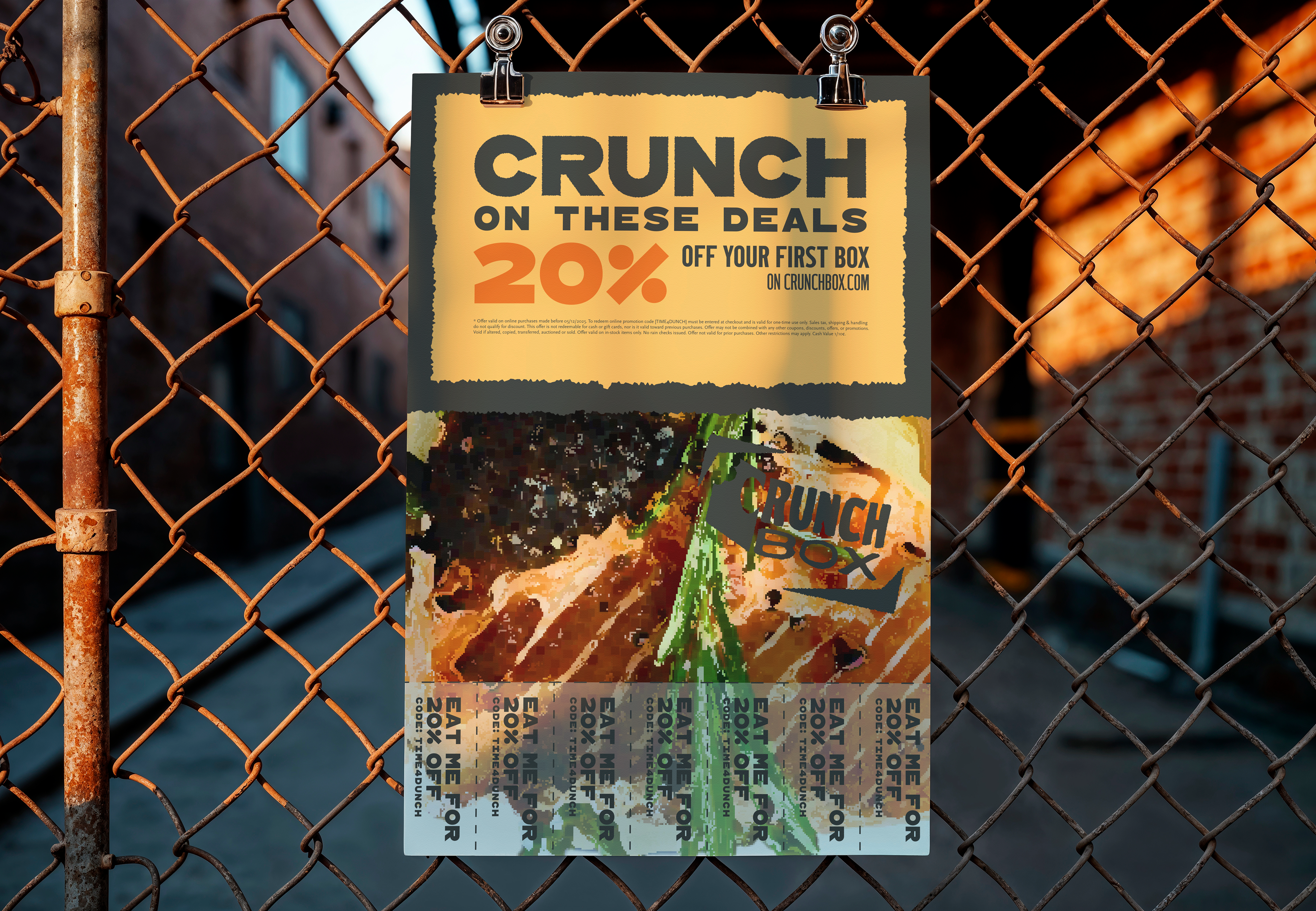

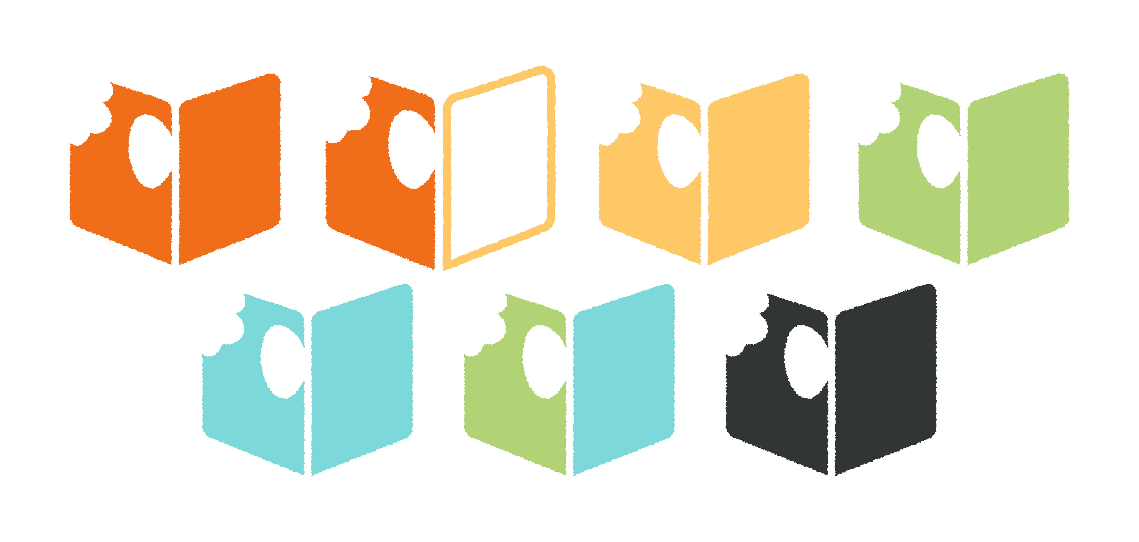
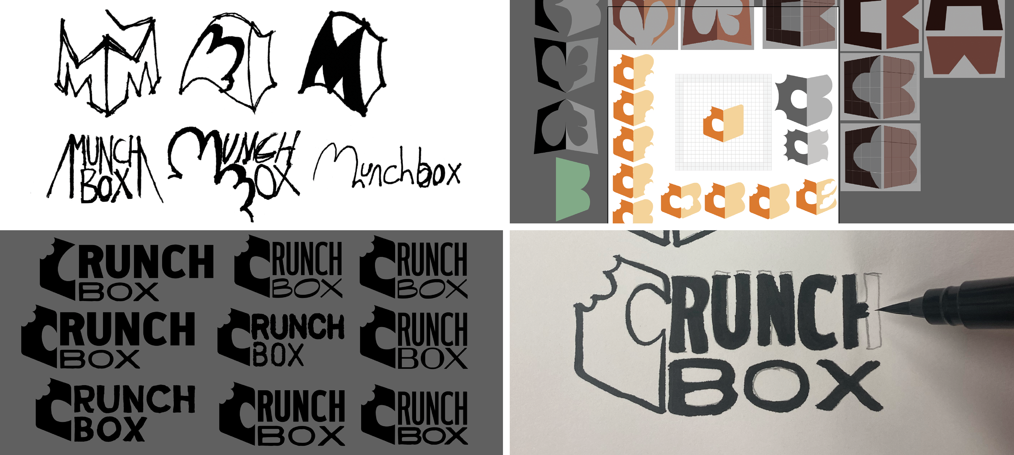
As the foundation for Crunchbox’s visual identity, the logo had to be cubed and textured. Or more accurately, crunchy. The combination mark was created by drawing over the fonts with an ink pen, then scanning them in and vectorizing the result.
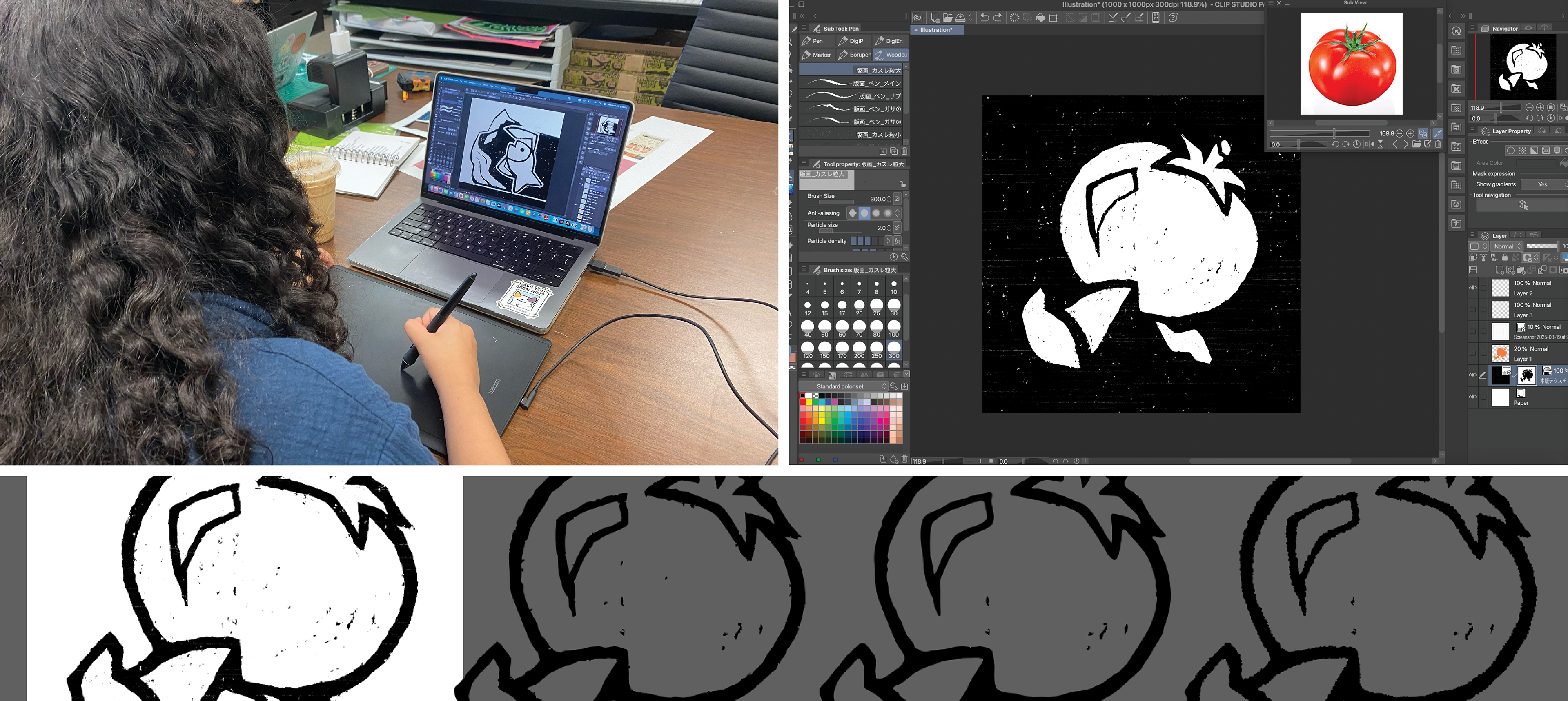
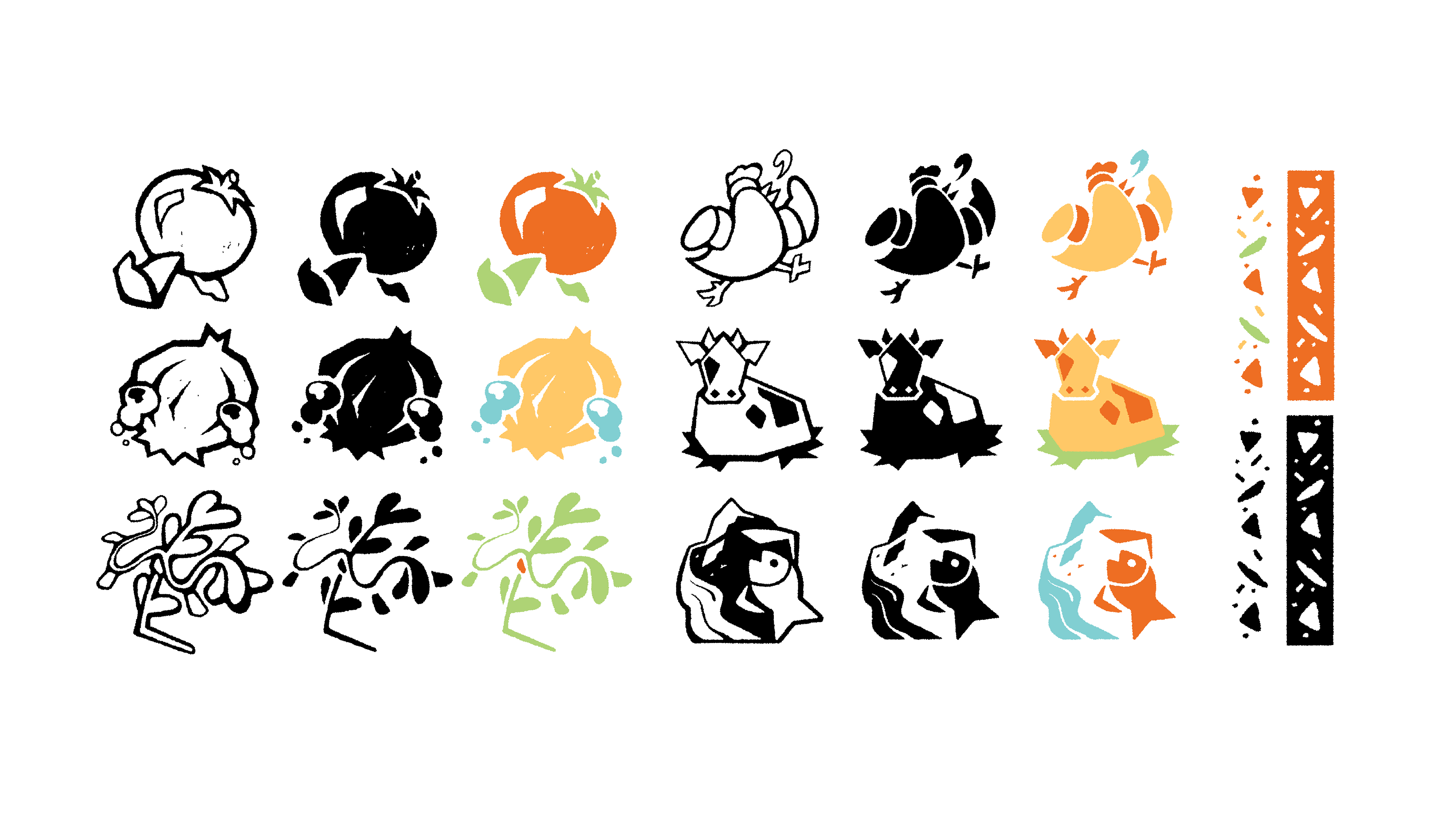
To make the icons, I carved my digital canvas like I was working with linoleum. They all start with a humorous take on an ingredient, like a crying onion or ground beef. The art is then vectorized, smoothed, and put under a roughen effect to create a consistent look while replicating the appearance of ink bleed.
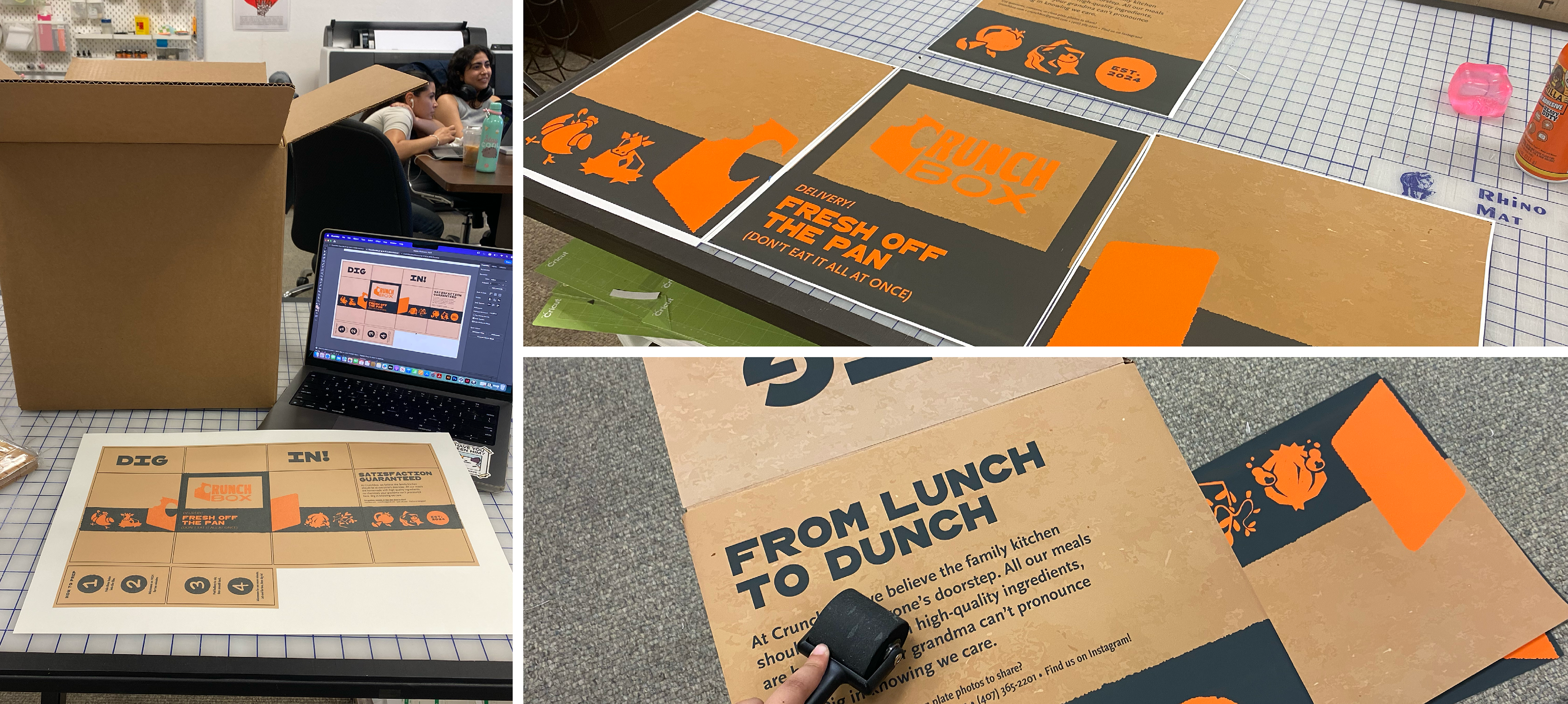
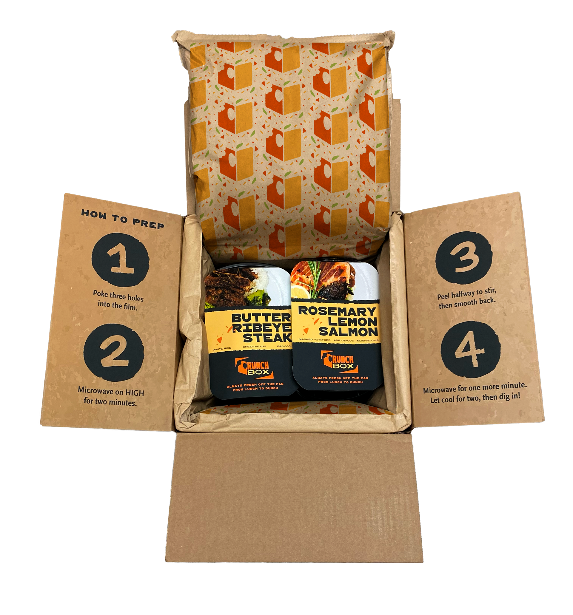
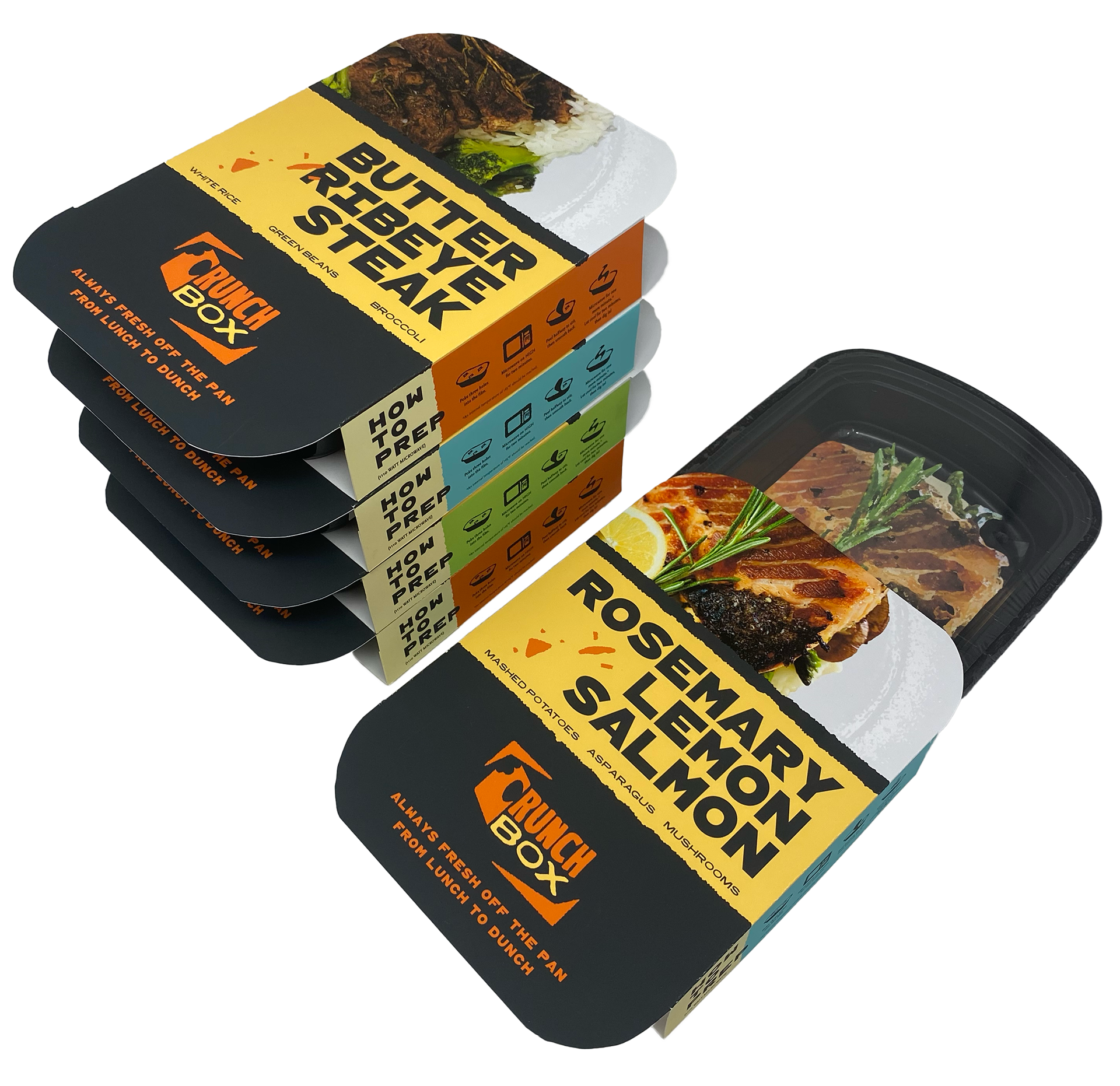
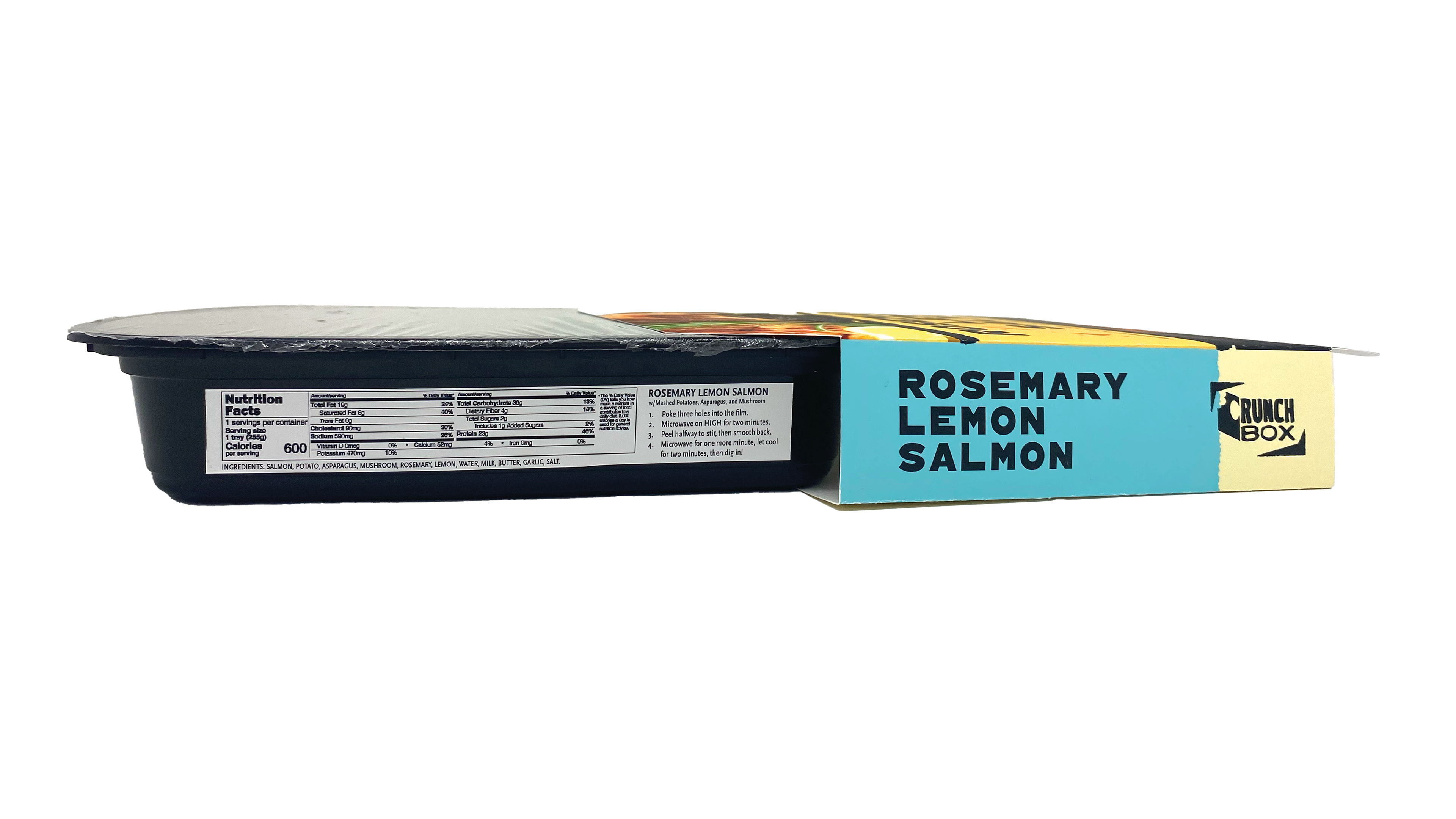
For the box, I wanted the unpacking experience from the customer perspective to be fun. “DIG IN” invites them to think of cutting it open like pulling out the kitchen utensils. Constructing it on a shoestring budget required a little ingenuity. I used 15”x15” sheets of sticker paper to create the illusion of being screenprinted.
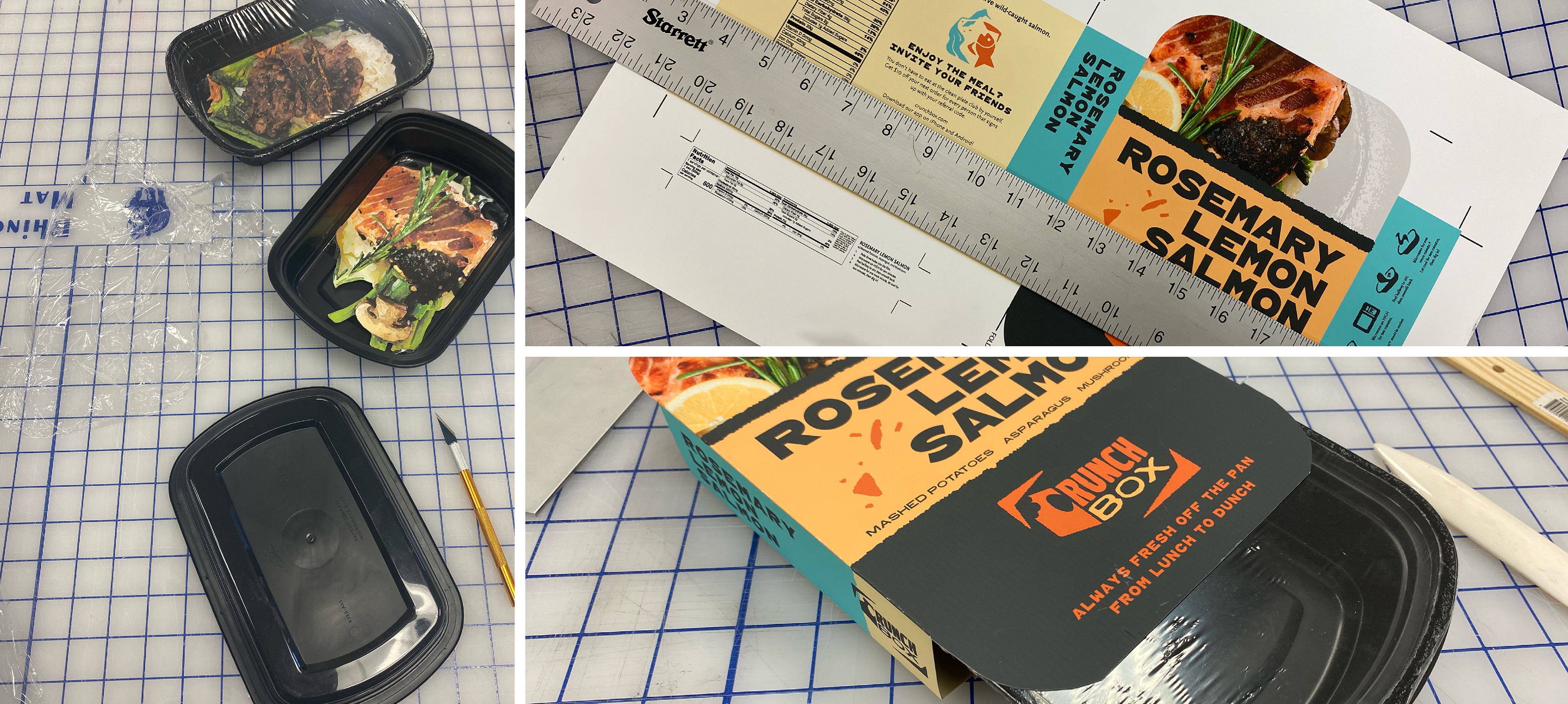
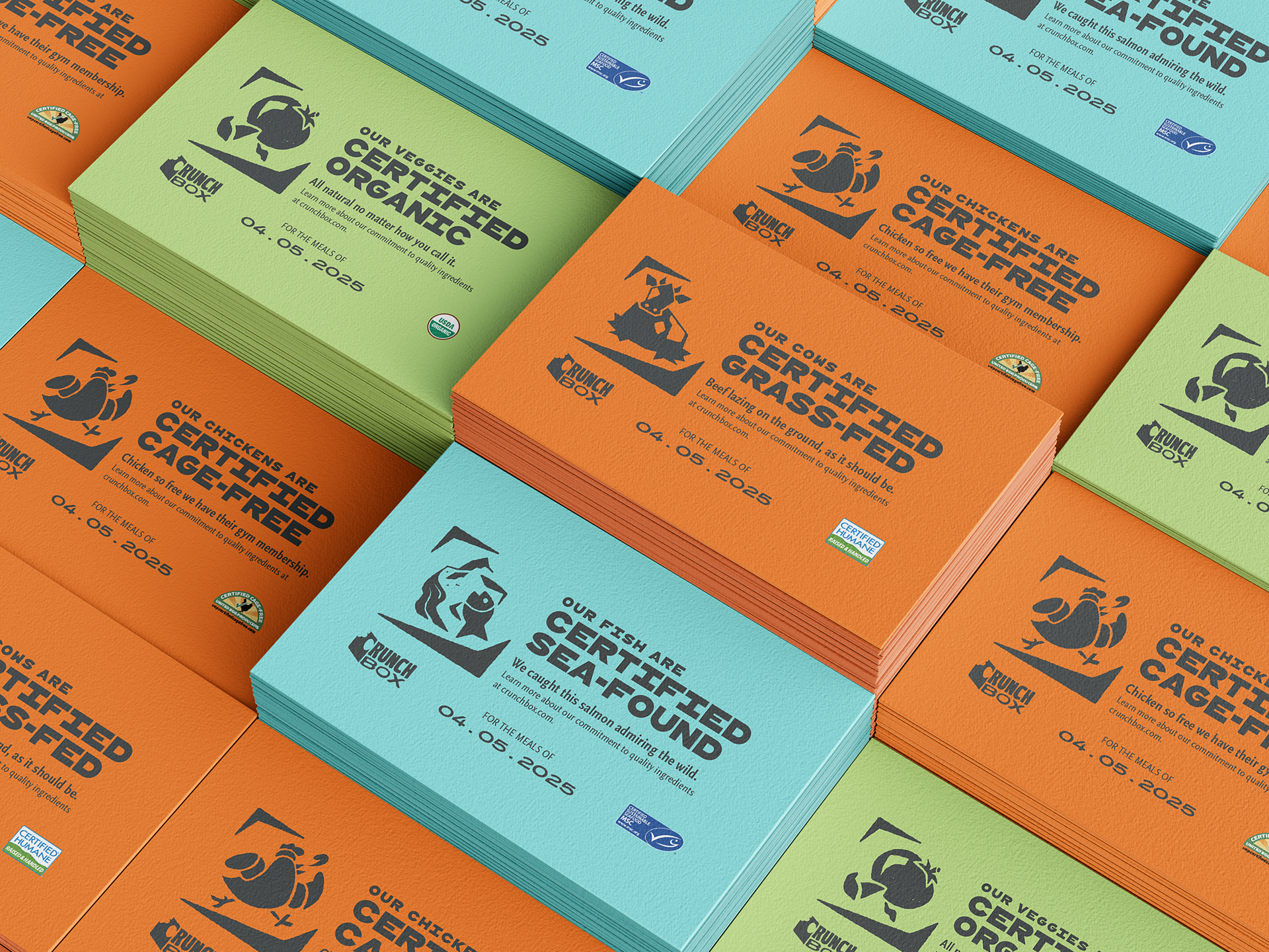
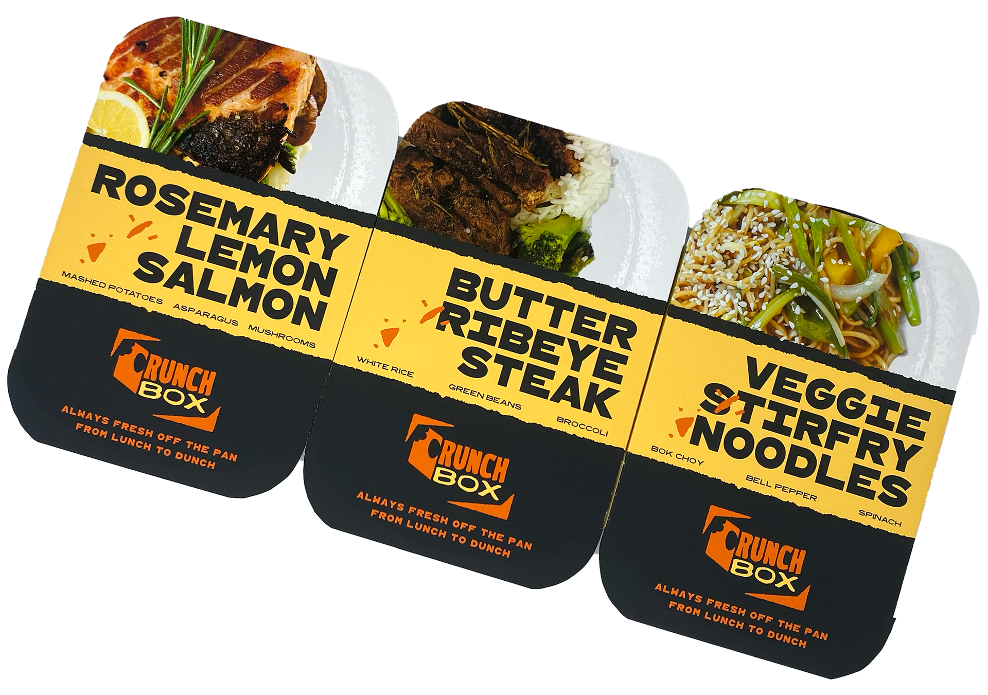
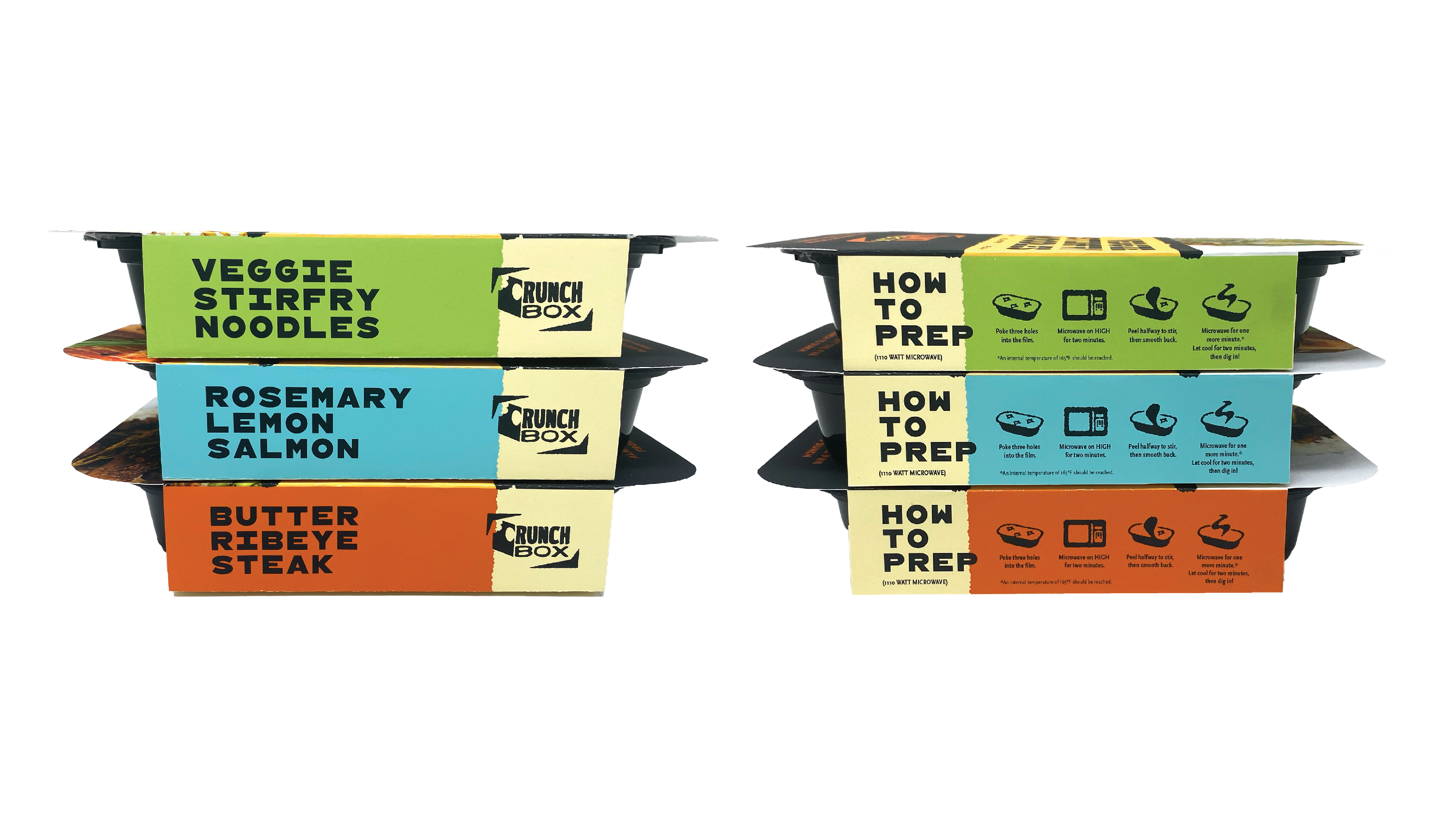
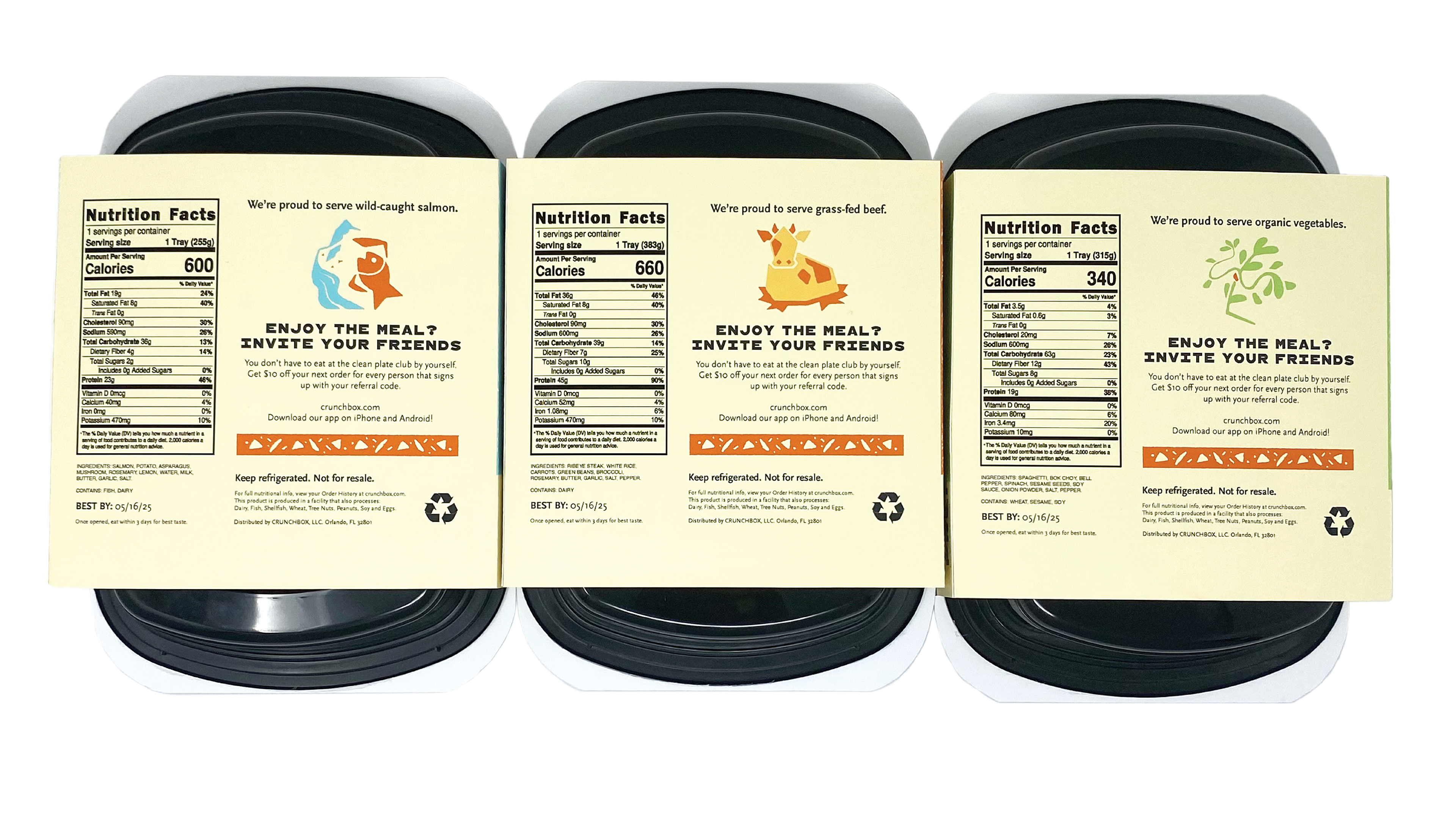
The minimum number of meals someone can order per week is seven. With that many containers in the fridge, they needed to be easy to organize when stacked. Each meal sleeve is color coded by what kind it is: beef/chicken, seafood, and vegetarian. The customer can immediately tell which category they’re picking out from the side.
Product Photography, Illustration, Design, Assembly, Copy: Skylar March
Mockups: Mockup Design and Freepik